BEAM
YEAR
2020
CATEGORY
Brand Identity
Stationary
Web Design
CREDITS
Sean Bacon
Bradford Prairie
OVERVIEW
Beam is a solar energy company that provides services to residential customers in large urban neighborhoods. Beam brings clean energy to environmentally conscious homeowners wanting to incorporate sustainable energy into their lifestyle. Beam targets tech savvy, upper middle class homeowners aged 35-50.
SOLUTION
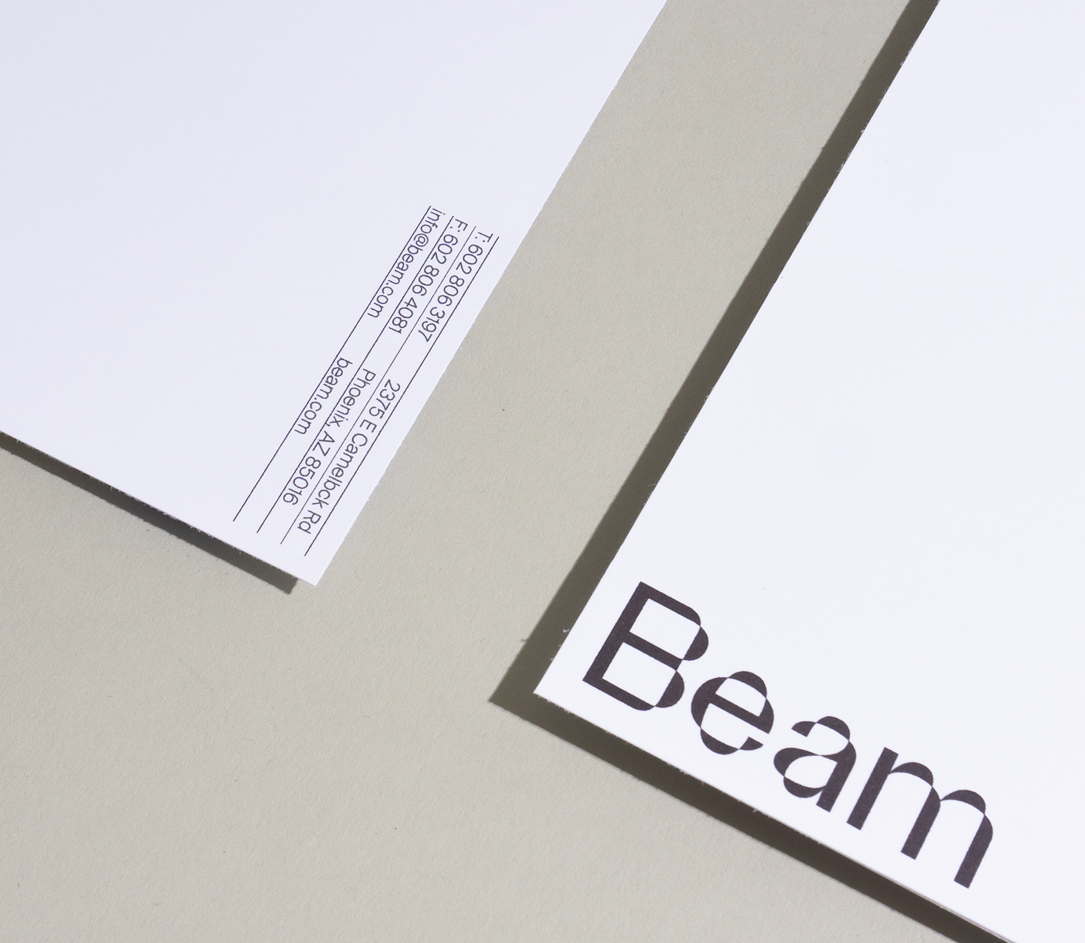
To express the brands use of solar technology, light refraction was used as inspiration. As light refracts and cuts through planes, so does this typeface. Beam uses Parabole for its word mark because of its illusionistic form that renders the look of light reflecting off of solar panels. The website interface is straightforward, and user friendly. Swiss aesthetic and a minimal color palette was used to keep a sophisticated identity throughout the brand.